
Today we’re talking cover design! Fun stuff right? Well, some people certainly think so, devoting their entire careers to the art of creating amazing book covers. Cover designers stand between authors and the public. They help authors make a great first impression on readers by designing the perfect cover for new novels.
I’m currently choosing a cover for my first novel, so it seems just right to discuss what authors and readers look for in a cover. This is especially true with so many premade options on the market today. I initially designed a cover off of ‘vibes’ that I felt about my book. Later, I realized, that just because that image matched the vibes I felt in my book, didn’t mean that it was a good cover.
I’m very thankful I figured that out before officially publishing. “Don’t judge a book by its cover”, definitely doesn’t apply to actual books. The cover is the book’s first impression with readers so it is important to get it right!
So, what elements does a successful cover possess? Well, get excited because I’m going to tell you!
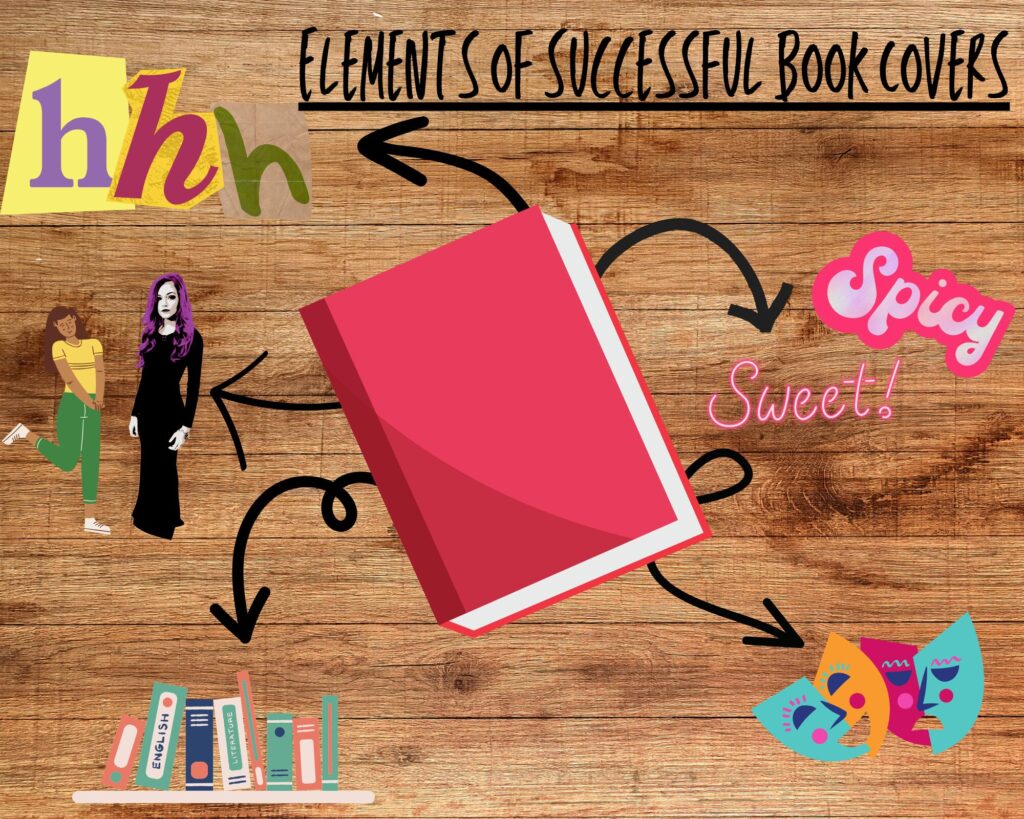
5 Elements of Successful Cover Design
Know the Target Audience
The elements that make a successful small-town romance cover are NOT the same ones that make a good dark romance cover! What does that mean? Readers expecting a sweet, small-town romance and get a much darker surprise, are less likely to recommend that book. Not to mention readers may leave lower or negative reviews if the book does not meet expectations. Many 1-star reviews have been received for this very reason.
Recently, I’ve also been seeing frustrations with some covers for spicy romances looking too much like a Young Adult novel. This sometimes results in much younger audiences reading mature content. Authors should be aware of their target audience and work toward tailoring their cover choices toward the correct demographics. This benefits the reader and the author; the reader gets the book they’re expecting and the author doesn’t receive a 1-star review for a controllable miscommunication.
Know What’s Trending in the Genre
The other side of ‘knowing the target audience’ is knowing the genre. As I mentioned above, there is a noticeable difference between dark romance and small-town romance. While overall trends may follow the same lines, there are bound to be elements that differ by genre. One example of this is the trend toward illustrated covers. We can expect to see illustrated covers in contemporary romance but I have yet to see a dark romance cover done in an illustrated style. The emotions the author hopes to invoke may differ based on the genre as well, making it imperative that the author know exactly which genre of readers they are hoping to reach.
Color & Imagery
Color and imagery go hand in hand with knowing the genre. Contemporary romance novels are trending toward bright and vibrant colors or pastels, while darker romances and suspenseful romances trend toward darker, more serious colors. Additionally, the imagery changes based on which genre the author is writing in. This also changes with trends. A good example of this is the current trend toward illustrated cover art. Many contemporary romance novels are moving away from having actual models on the covers and opting for a less serious, illustrated version. Even some classic romance novels are going through cover redesigns to breathe new life into the stories.
Understanding which imagery is trending is vital as those first impressions may be based solely on what the reader sees on the cover. Beyond illustrated covers, another common trend right now is utilizing objects for symbolism. This came about in the early 2000s and has continued into the 2020s. Similarly to product branding, authors may seek to establish a connection between an object and their book. Additionally, an object as symbolism on the cover of a novel can be a great foreshadowing tool for authors!
Typography
Fonts can also have a huge impact on whether or not a reader will take a chance on a book. While traditional romance novels suggest using a script or Ye Olde English font might work best, big, bold, and easily readable fonts are trending in 2025. These fonts tend to involve fewer frills, are crisper, and can take up decent real estate on the front cover of a novel. Script is being used more sparingly and if utilized, is only taking up one word on the cover to create a bit of variation among the title words.
However, just because cleaner fonts are being used, doesn’t mean that script fonts should be abandoned altogether. If a script font fits the genre and novel best, then by all means, go for it! The imagery and the font should complement each other so as long as you’ve succeeded in that aspect, congratulations!
Don’t Ignore the Spine & Back Cover
Finally, while the cover may be the showstopper, don’t forget about the spine and the back cover! This can sometimes be easy to forget, especially as more and more people read on e-readers and don’t have a physical copy of the book. However, for readers who prefer physical copies, the book’s spine is likely what will face the room, while the back cover contains the blurb and any information that might help hook the reader by giving them a bit of information about the characters and story. Provide careful detail to the spine and back cover as well, while focusing strong attention to detail and consistency across the entire cover.
*Side note: if you plan to write a series, readers LOVE when book spines match or follow a pattern that may create an image.*
There you have it! This is the most bare-bones, stripped-down explanation of what in the world we’re looking for with cover art. The cover is the face a book presents to the world so it is an author’s job to make sure that it’s the best face they can give it. Working with a cover designer to get it just right is a great option for authors. Whether the cover is premade or custom, cover designers can help elevate a book from a self-published cliche to a work of professionalism and art!
Want to know more? Questions or Comments? Drop them below, and as always,
Happy Reading!
Leave a Reply